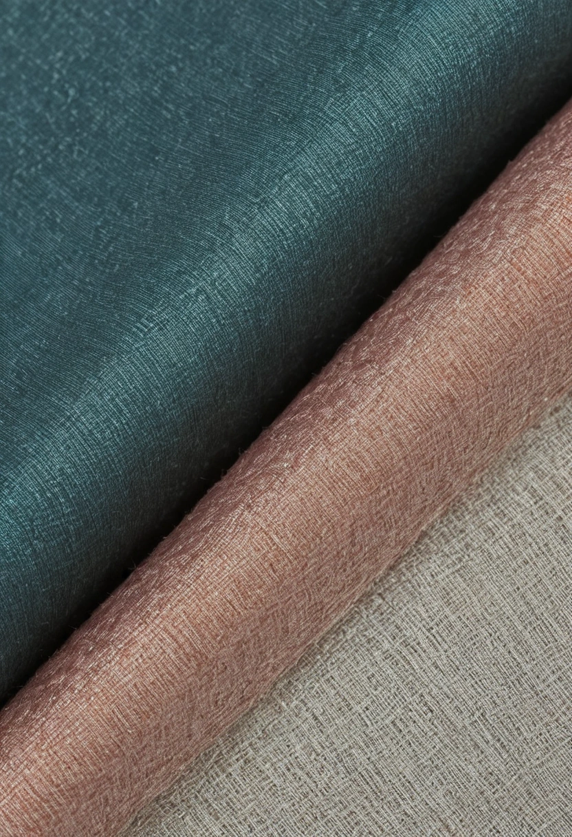
A wall, sofa, and curtain rarely show the same color in the same way. Sarelli Textiles is an Italian manufacturer of furnishing fabrics and sheer curtains. The design task is to compare those surfaces at their actual scale and under the light the room will use.
A paint card is opaque and smooth; a textile has yarns, folds, shadows, and sometimes pile. Two samples with similar color names can therefore diverge once the curtain hangs beside the wall. Make the comparison in the room before ordering. The goal is not to force every material to match, but to decide which differences are deliberate.
Why does the same nominal color look different on a wall and a fabric?
The same nominal color can look different because paint and textile reflect and scatter light through different surfaces. A matte wall creates a broad flat field; a woven cloth changes as yarn direction and folds catch light. A sheer includes transmitted light from the window. A pile fabric can shift from light to dark as its surface direction changes. Color names on separate supplier cards cannot express these physical differences.
The U.S. Department of Energy’s LED Basics distinguishes the appearance of the light source from color fidelity, the way the source renders objects. That distinction matters in a material comparison. A lamp that looks pleasantly warm may still render one red or blue fabric differently from another lamp with a similar visual warmth.
Start with real samples: a painted board large enough to show the intended finish, an upholstery swatch large enough to bend, and a curtain length that can be held in folds. View the board vertically where the wall will be, the upholstery horizontally or on the seat, and the curtain in front of the glazing. Laying all three flat on a table is convenient but removes the light directions each surface will actually receive.
Should wall paint be chosen before the fabrics?
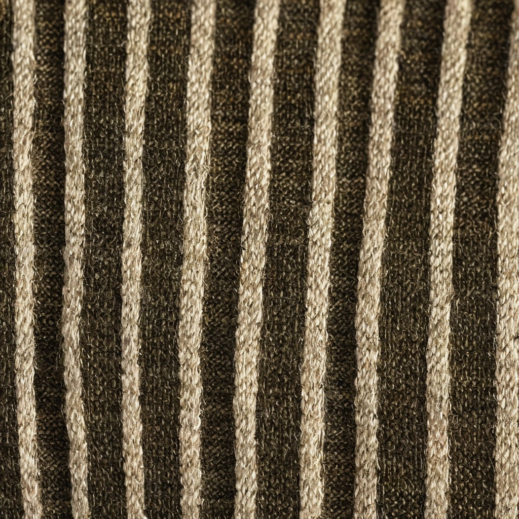
The order depends on which material is hardest to change. Paint can often be mixed again after a fabric is selected, while a textile with a particular weave, repeat, or performance specification may have fewer acceptable alternatives. For a room led by a distinctive upholstery or curtain material, select the textile first and tune the wall color around it. For a historic room with protected wall finishes, treat the wall as the fixed condition.
Begin with constraints rather than a universal sequence. Identify existing flooring, daylight direction, furniture that will remain, and any fabric already ordered. Decide which element carries the dominant color and which elements support it. Then test a small group of candidate paint boards beside the actual textile. Reject a board because of what it does in the room, not because its digital swatch seems slightly different.
A pale wall can make a pale curtain look grayer by comparison. A saturated wall can make a small accent color in upholstery seem more prominent. These are perceptual observations to verify with the actual samples; they are not fixed rules about a named color family. Photograph the arrangement for discussion, but approve against the physical boards because camera exposure and screen settings alter the record.
| Surface | Position for test | Question |
|---|---|---|
| Wall paint | Vertical board near final wall | Does finish alter the perceived color? |
| Upholstery | Over seat or arm shape | Do shadows and pile change the value? |
| Curtain | In folds before the window | Does backlighting change hue or opacity? |
| Rug or floor | On the actual floor | Does the palette stay balanced from the doorway? |
How should daylight and electric light be used in approval?
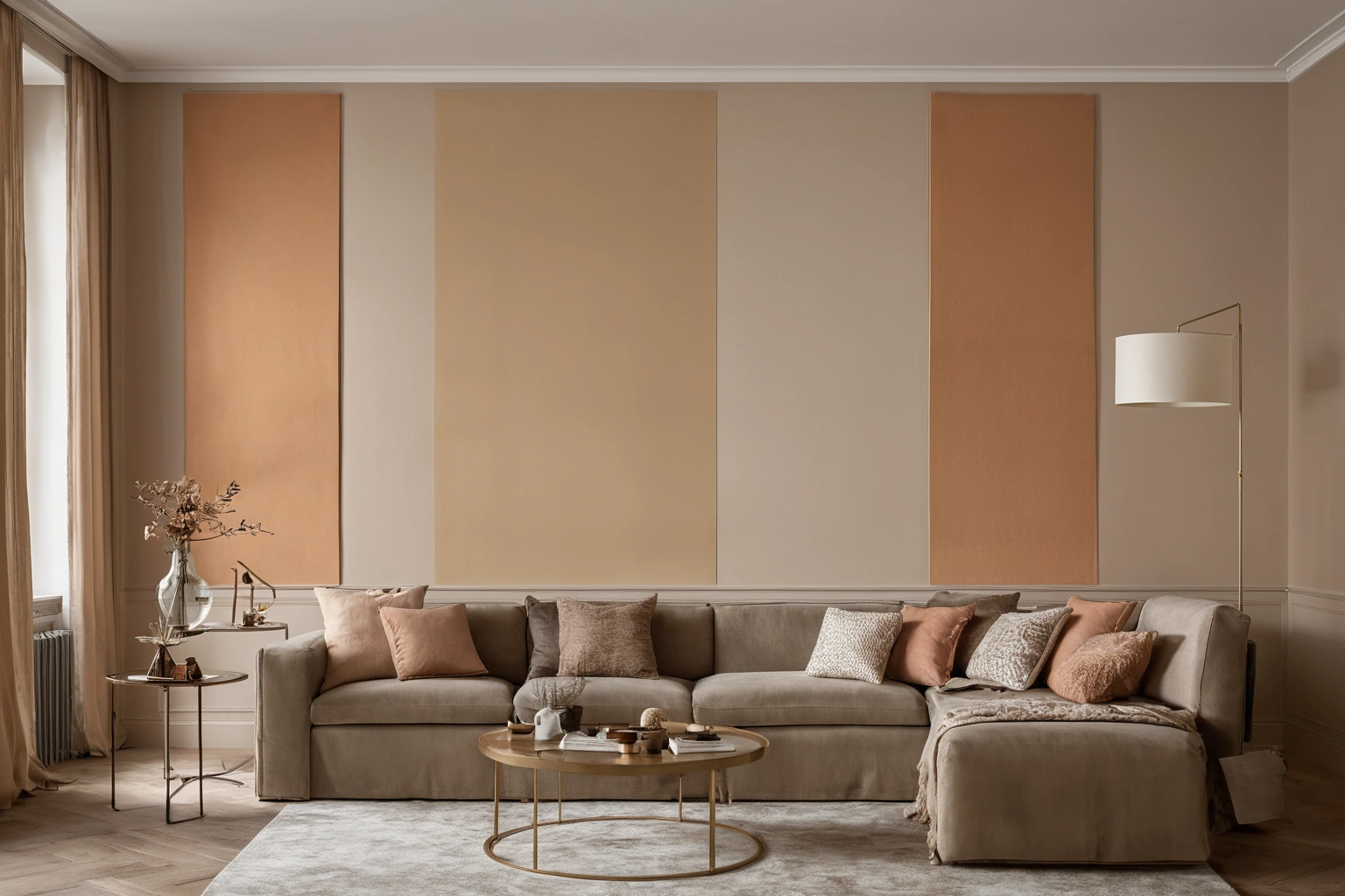
Approval should include the light conditions under which the room is normally occupied. Daylight changes through the day, while evening lighting depends on lamp spectrum, placement, and dimming. DOE’s lighting guidance describes correlated color temperature as the light source’s color appearance and color rendering as a separate measure of how objects appear. A warm-looking bulb and a cool-looking bulb can make the same curtain read differently.
Choose at least two meaningful observation times: the room’s usual daytime exposure and its normal evening setting. If a room is rarely used at midday, a perfect noon match is less valuable than an evening combination that remains coherent. Use the actual lamps or specified mock-ups, including any dimmed state. DOE’s discussion of color-tunable LEDs notes that products with the same stated color temperature can differ in rendering. The sample, not a single Kelvin number, remains the practical check.
Also distinguish color shift from fading. A textile can look different under warm light immediately without having changed physically. Long exposure can change its dyes over time. The National Park Service’s textile conservation guidance describes light damage as cumulative and irreversible. Museum display limits should not be transferred to a home, but the distinction matters when a window-facing fabric is selected.
How many colors can a room use without losing a clear hierarchy?
A clear hierarchy is more useful than a numerical color quota. Decide which large surface leads, which material repeats its tone, and which smaller detail offers contrast. A restrained wall can support a patterned sofa; a strong wall can work with quieter textiles. The actual amount of visible fabric matters more than the number of colors listed on a board.
Assess area, not only hue. A small saturated trim may affect a room less than a large pale curtain, yet the saturated accent may attract more attention. A curtain that covers an entire wall when closed can become the room’s dominant color at night. The same curtain can almost disappear when open. Draw both states on the room elevation before approving the balance.
Use material texture to separate near colors. A flat painted wall and a woven curtain in related tones can remain legible because they respond differently to light. Conversely, three surfaces with strong sheen can compete even if their colors are restrained. A palette should be judged as a composition of surfaces, not as a row of printed chips.
What should be documented before materials are ordered?
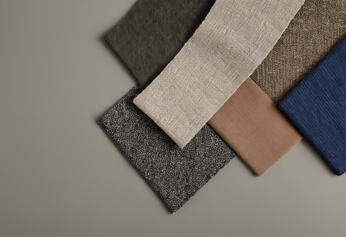
Record the exact paint product and finish, approved textile references, colorways, direction, lining, and the lighting state used for approval. Keep physical samples together. If a fabric is substituted, repeat the comparison rather than assuming the same color name will produce the same result. A small change in weave, pile, or backing can alter the final appearance.
- Use a painted board instead of relying on a screen color.
- View upholstery on a curved form and curtains in folds.
- Test by the window in daylight and under the planned lamps.
- Check the room from entrance and principal seating positions.
- Preserve the approved references for delivery and future replacement.
Color agreement is a decision made among actual materials in a specific room. A wall, sofa, and curtain can be similar without matching exactly, or contrasting without clashing. The room test tells the team which relation is intentional and whether it survives the lighting conditions that will matter to the occupants.
A large sample also tests how much of a textile’s color is visible after making. The back of a curtain and the front of a curtain are different views; lining may alter transmission, while folds create alternating highlights and shadow. The upholstery face can likewise look lighter on a seat than on a vertical back. Discuss those differences before the client approves a small swatch held flat in hand.
If the room includes a patterned rug, use a visible portion of its field and border during the palette review. The rug may introduce several colors in different proportions. Pulling a tiny accent from the rug into both wall and curtain can overstate that accent once the room is furnished. A full rug sample or a scale-accurate image helps the team judge relative area.